ggplot2 : scale axis 调整坐标轴
例如大数据量时,画比例累计图。
x轴是对象的id,长度转换成log10样式,横坐标以10^x格式显示。
y轴是累积的比例,转换成百分比格式显示。
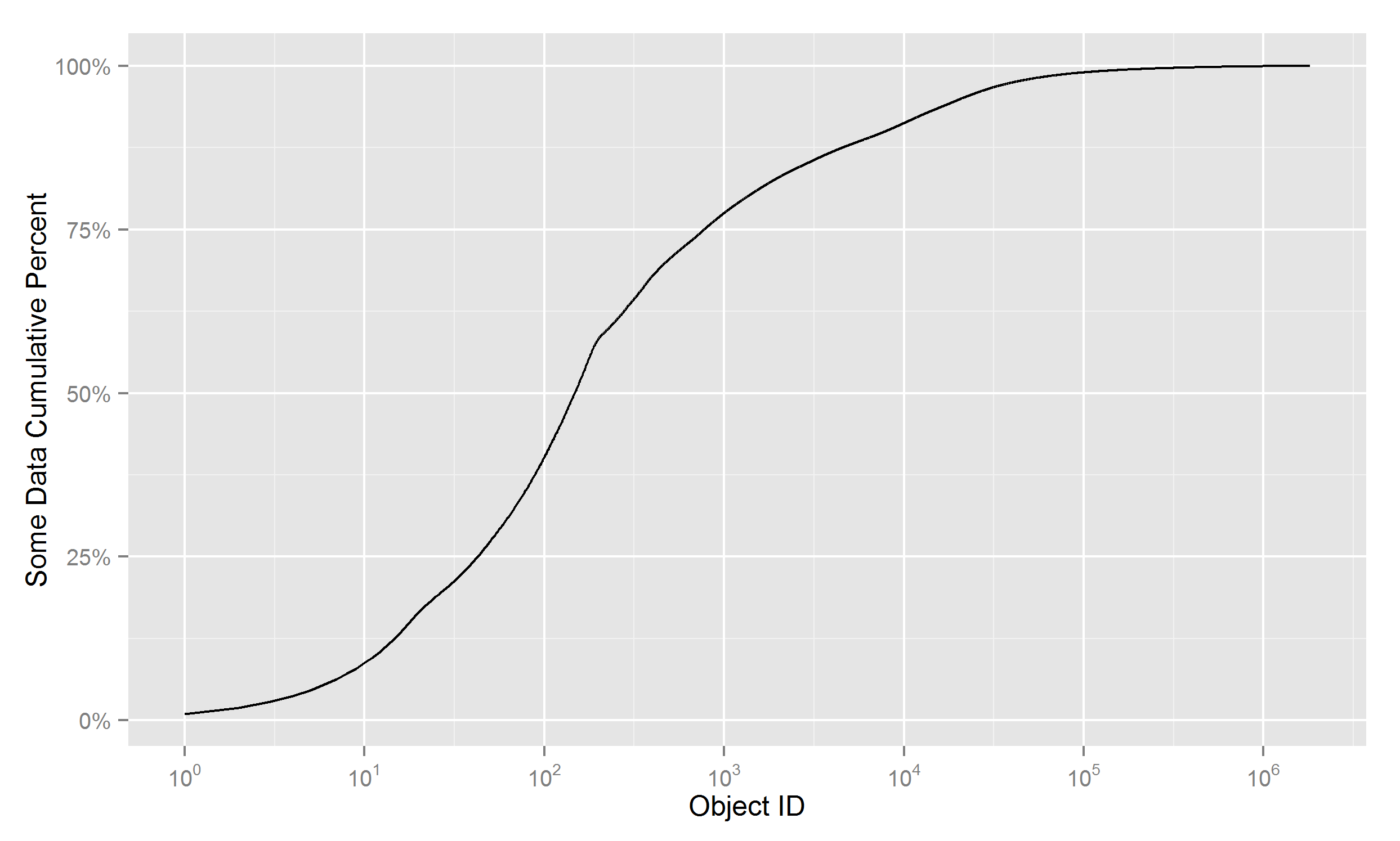
原始数据:第1列为ID,第2列为累积比例
1 0.00991711708918075
2 0.0190397740508852
3 0.0280992557817759
4 0.037095216538665
5 0.046031607187244
......
......
1807458 0.999999999434136
1807459 0.999999999575602
1807460 0.999999999717068
1807461 0.999999999858534
1807462 1
画图代码:
library(ggplot2)
library(scales)

df = read.table('somedata.csv')

gp <- ggplot(df, aes(V1, V2)) + geom_line() +
    scale_y_continuous(
            name = 'Some Data Cumulative Percent',
            labels = percent ) +
    scale_x_log10(
            name = 'Object ID',
            breaks = trans_breaks("log10", function(x) 10^x),
            labels = trans_format("log10", math_format(10^.x)))

print(gp)
ggsave('x_log10_y_percent.png')